Celia found her calling when she rescued Pepe, a dog who needed clothes to keep warm. Her friends loved her knotted garments, and soon she was making clothes and collars for their dogs too.
When she started her business selling pet accessories, Celia didn’t entirely grasp the struggle ahead — producing and managing her stock, building an online store, packing the merchandise, booking shipping services, ensuring the packages arrive in time — all while optimising costs and processes.
This is the story of how we redesigned Packlink PRO, a shipping platform to support merchants like Celia, by taking into account their needs.
Project typeB2Bparticipatory designuser journey
Total time~1 year
My roleUser Research, UX Design, Interaction Design, Graphic Design
Packlink PRO is a platform where merchants can compare and book shipping services (UPS, DHL, TNT and the rest). Its
goal is to support business owners in managing their shipping activity while saving time and money
— turning the mess of booking shipments into a simple flow.
When I joined the team, at the beginning of 2017, the one-year-old Minimum Viable Product of
Packlink PRO had already become an unfortunate case of creeping featurism. The user experience continued to be immature, while advanced features were added without a deep understanding of user needs. Incomplete features burdened the interaction and usability.
This had a direct impact on business. The platform couldn't retain its most profitable clients — large volume shippers —
for long. With only basic and half-baked features, merchants with large volumes of shipments would
rather turn to alternatives.
A layoff and a small team
The week I started, more than half of the dev and product teams were laid off as part of an internal restructuring. I ended up the only designer in a product team of two, together with the head
of product, Guillaume Berthet.
As we didn't know enough about user needs, Guillaume decided to focus development on small product improvements while we did user research.
That way we could make strategic and meaningful improvements.
Being the only designer in the company, my role became
comprehensive:
from leading user research to crafting icons
from building hi-fi interactive prototypes to assembling information architecture
from analysing rich user data to writing micro-copy
Despite the layoff's regretful consequences — demotivation, mistrust, and the ripple effect of people who stay not staying long — it created a suitable environment for me to research, learn, and experiment. I
had the freedom to follow proper design methodologies, decide my
own tasks, and make a fun sandbox out of my job.
Constraints
Gaining trust
Our colleagues saw an unnecessary hassle in us meeting users. Why
wouldn't we just listen to Customer Service and Sales instead? Why don't I just focus on
designing buttons? User-centred design was not part of the company's culture or focus. We
had to earn the company's trust that our methods would deliver meaningful results.
Implementing designs
With a small development team and few resources, many of the features I designed didn't get
implemented. Yet most of them were scheduled to be developed.
Designing for four countries
The shipping habits of users differ across the countries Packlink operates in — Spain, France,
Germany and Italy. In France and Germany drop-off shipments are common, while in Spain and Italy
most people ask for home delivery. Packlink was a market leader in Spain and Italy but faced
strong competition in Germany and France. I had to constantly be aware of these cultural and
market differences and how they affect the user experience.
Missing designer feedback
I also had to figure a lot of challenges out on my own, without guidance and feedback from other designers. At times
real-world situations exceeded the limits of what I could learn from literature, so I had to
learn by improvising and making mistakes.
Skipping steps
Being the only designer, there was only so much I could do. I went directly from sketching on paper to hi-fi prototypes in Sketch, skipping wireframes
and lo-fi prototypes.
Meeting merchants
Packlink PRO was built to support frequent shippers. One year in, thousands of users were
already shipping every month with it. But as a product team, we didn't know much about their shipping routines and needs. The
data we had came from online surveys, complaints relayed by Sales and Customer Support, and
analysing the competition.
An observational study
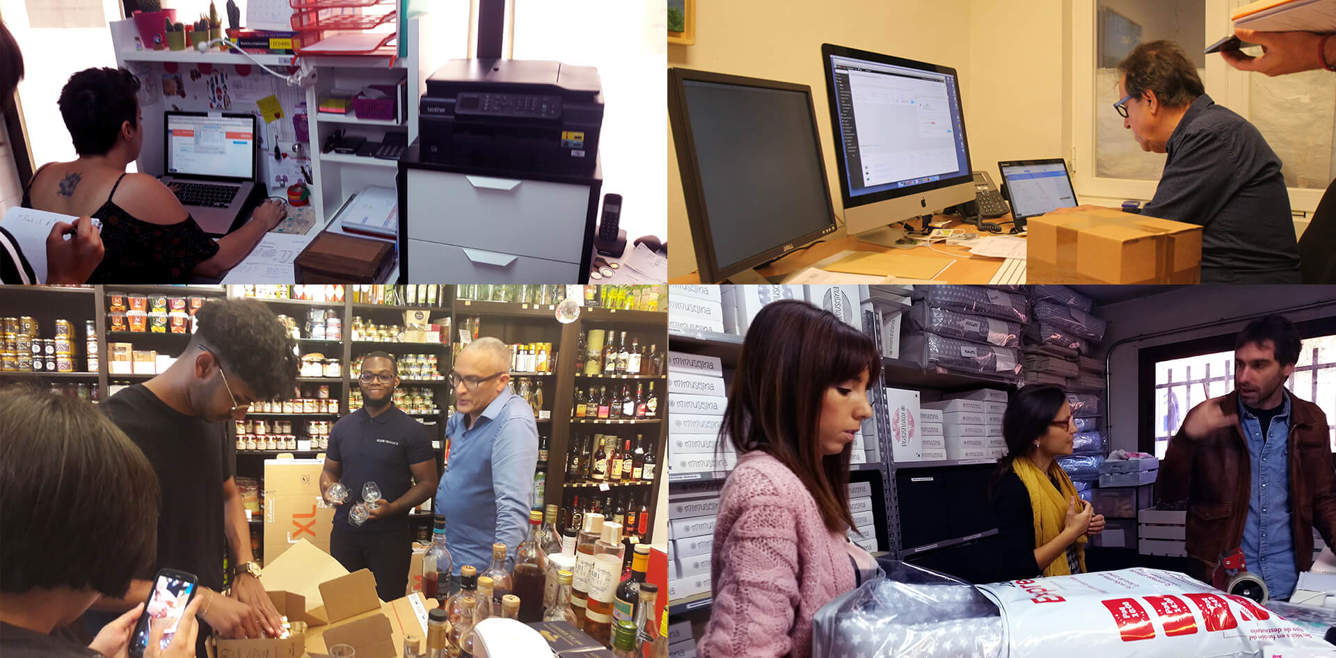
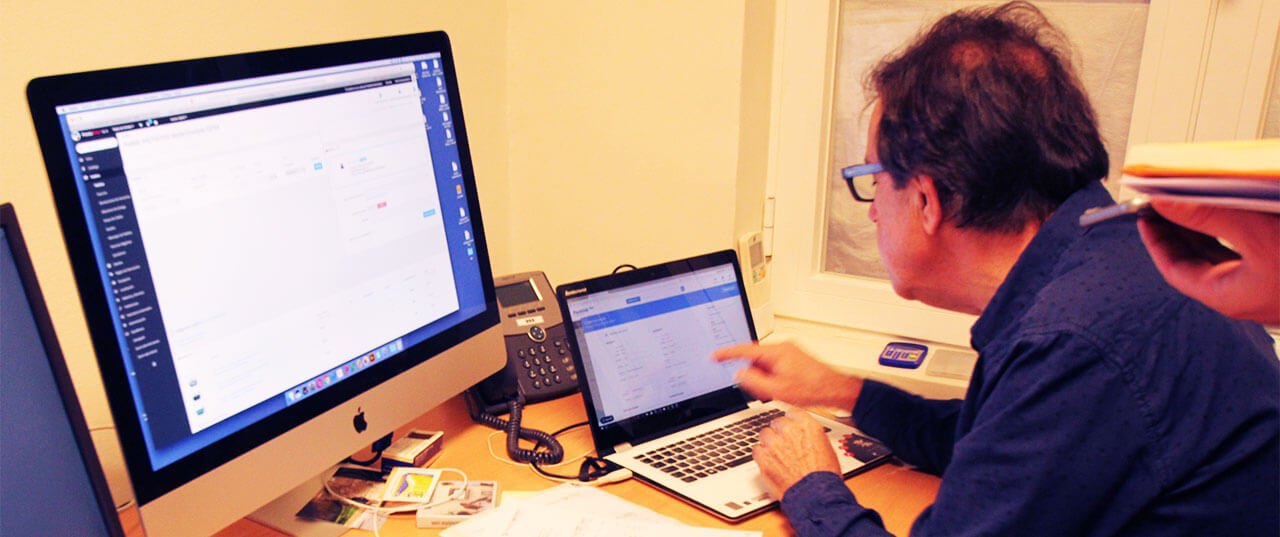
To understand the industry and our users' needs, I conducted an observational study with active users. The plan was to go to their offices and observe them while they use Packlink PRO to book shipments.
Language barriers and solutions
Neither Guillaume nor I had a good grasp of Spanish when we started the user study, so we brought along a 'translator' — a colleague from another department.
They would introduce the study and clarify misunderstandings.
Before each meeting, I would prepare the 'translator' for their role as a user researcher.
None had participated in user research before. Surprisingly, most understood the objective
position of the observer and the scope of the study. As both Guillaume and I could understand
Spanish, we took notes without breaking the flow of the observation.
A typical user meeting
Introduce ourselves
Explain the reason for our visit — understanding their needs
Get them to book a shipment
Observe their process, and take handwritten notes
Ask clarifying questions
Thank the user
Transcribe the handwritten notes and observations
This is how we learned the story of Celia and her pet accessories store, and of 21 other Packlink PRO users from Madrid and Paris. Each one
had unique business requirements and was facing challenges we could learn from.
22users observed
2cities, Madrid and Paris
2000+notes and pictures
4personas distinguished
Building personas
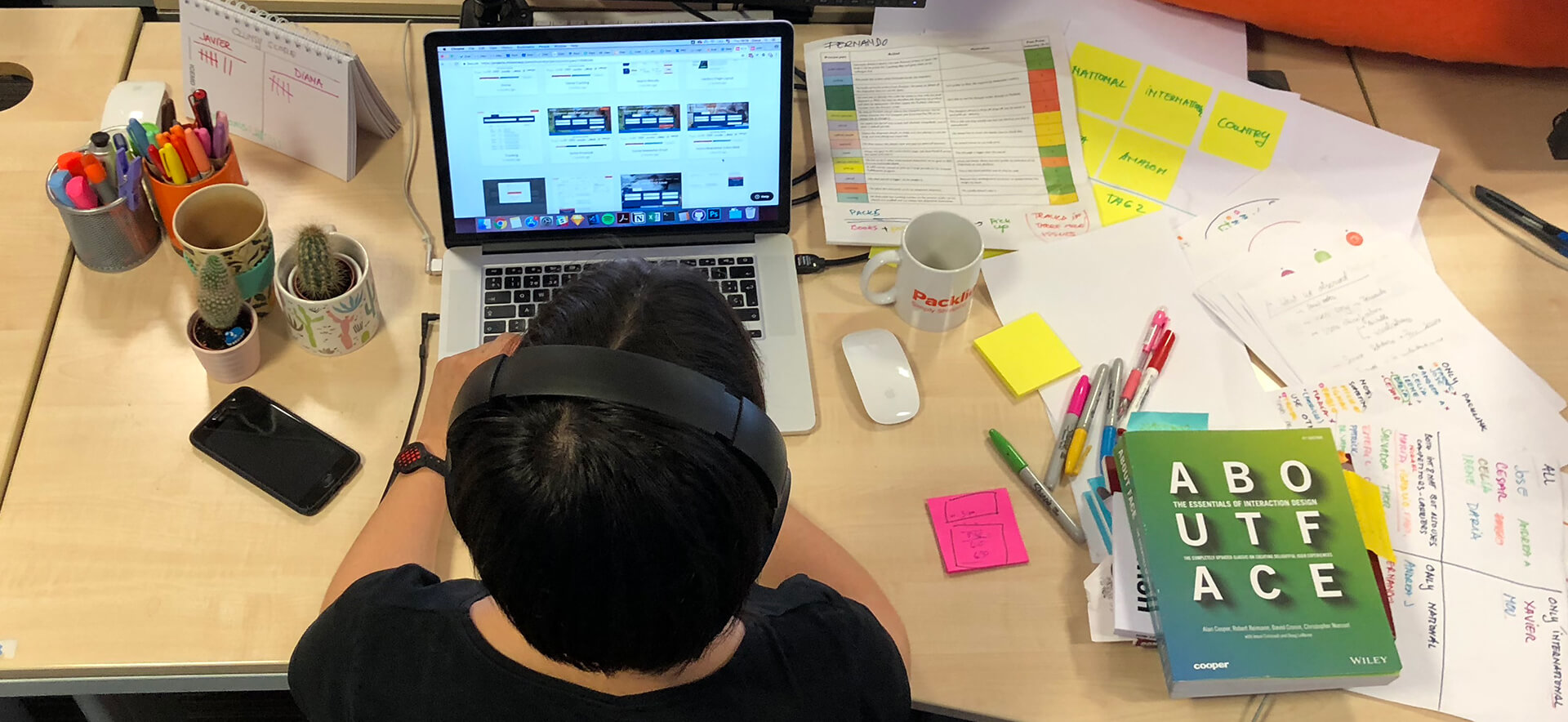
After meeting 22 users, it was time to find patterns and build personas. By now we had more than
2000 notes and pictures, from two different observers.
An unexpected thing occurred as I delved into the process. At one point — after step 7 — I
checked whether I was on the right track with About Face, the book that first got me into UX design. To my surprise, I had indeed intuitively followed that process. Re-reading it helped me order my
methodology and explain it clearly to my manager.
We individually labelled the observation notes and I identified higher level dimensions and
categories using the grounded theory method.
Labelling the observation notes.
From the dimensions, I extracted the stages of users' shipping process.
The stages of the shipping process, extracted from the dimensions.
I compiled each user encounter into a chronological story: a
narrative about how that particular user went through their shipping process, and the
challenges she encountered.
One encounter, retold as a chronological story.
I then synthesised each user's shipping process into a visualisation, to identify behavioural patterns. It was interesting to note
how their process was influenced by internal motivations (having control) and by software choices (importing the orders from
a store).
Each user's shipping process, synthesised into one visualisation.
I plotted the users we met across different variables: type of
business (B2B or B2C), use of shipping platforms, shipments per month, shipping process.
The users we met, plotted across the variables that separated them.
Behavioural patterns emerged through the visual exploration of the
different variables and their correlations.
Patterns emerging out of the correlations between variables.
I distinguished personas out of the emerging behavioural patterns.
Distinguishing personas out of the behavioural patterns.
I wrote context scenarios to outline the behaviour of the personas.
Context scenarios outlining how each persona behaves.
I sketched the personas' visual representation, based on the
relevant sections of the context scenarios.
Sketching how each persona would be represented.
Finally, I crafted the visual persona documents. We used them
in the product team as a reference, and introduced them to each department during a meeting about the vision
for the product.
The finished persona documents.
We distinguished four personas by analysing our users' behaviours:
shipping process
how they select shipping services
use of other platforms
volume of shipping
business type
The personas differed through goals, motivations, behaviours and environment.
Meet Celia, an archetype of some Packlink PRO users.
Building user journeys
I faced one of the biggest challenges yet when it came to building
the user journeys. I had never defined one before, so I turned to ✨ the internet ✨ for help.
This initially became a dead end — all articles referenced the same five examples, and I struggled to find a meaningful purpose for user journeys in the current context.
Who would it help?
the product team — exploring how new features would help solve merchants'
real-life issues, in an ideal experience
the marketing department — optimising acquisition, onboarding and retention
the rest of the company — showing them the current experience users
go through
Despite my doubts, I started building user journeys, following Kate Kaplan's guide on NN/g.
I went through the user stories and took out interesting occurrences specific to each persona.
Pulling the occurrences specific to each persona out of the stories.
I built 'a day in the life…' stories for each persona.
'A day in the life…', one per persona.
I then defined the journey wireframes, based on 'a day in the life' using the current product.
The journey wireframes, built on the product as it stood.
But the moment it finally clicked was when I stumbled upon Simon Pan's case study on Amazon Music. What I needed was to show how by seizing opportunities we would improve the user experience. This
way I could explore the impact of new features as well as tell the story of how the user
currently experiences the interface.
I identified opportunities out of breakdowns, and how their corresponding features would affect
the user's experience.
Opportunities, identified out of the breakdowns in the current journey.
Finally, I crafted the user journey structure and the hi-def document.
The structure of the finished journey document.
The current vs. ideal experience Celia
would have, if Packlink took advantage of the arising opportunities.
In the meantime, Guillaume shaped the strategy for the product's future and presented it to each
department, together with the personas.
Great on paper, failure IRL
For the product team, the personas became reference points in our
everyday discussions, although by this time we had already defined many features. The most
valuable outcome was the process of creating them, because it helped us define the impact of potential features on the user experience.
The personas and user journey documents also became part of the onboarding process for new
members of the dev team. This visual and narrative documentation helped our new colleagues understand the users better.
Yet at a company level, the personas and journeys were just pretty documentation pinned on a wall. Looking back, I can now point out some basic mistakes we made.
Not having leadership support
Guillaume and I started the entire user-centred design process as a 'guerrilla' product operation. We had little resource or support,
but no one really stopped us, so we continued. As I was exploring the data and methodology, I didn't explain the details of my process. For the management team,
I was just 'working on personas' for about a month. In the end, for most colleagues, it felt as
if these documents came out of nowhere.
Not involving other departments
Even if we asked colleagues to join us during user observations, they weren't involved in the actual analysis and synthesis process. In a
different, research-focused project I asked more than three
departments for input, and they became very involved in it.
Not explaining how to use personas
The company was still in convalescence after a previous bad experience with personas being imposed without
bringing value to the table. So we tried to avoid enforcing them and ended up being too shy about explaining how to use them. We
introduced the notion of 'users like Celia' but didn't confidently introduce Celia.
Not presenting the personas and user journeys together
Personas are an abstract tool — they represent archetypes of users. The user journey would have
brought them to life in a more concrete manner, with examples of how they would act. But by the
time I finished the user journeys, Guillaume had already pitched the new product strategy,
showing only personas.
Design process story
As we got to know our users' needs, I started prototyping to explore solutions. When I had the
main parts of the booking flow, I decided to test the interactive prototype with the users.
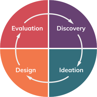
Finally, the design process came full circle: discovery — ideation — design — evaluation. We combined the
'discovery' and 'evaluation' phases during our customer visits: first we observed the
participant using the current product, and after that we introduced the prototype and provided a
few task-based exercises.
The generative design process, as it actually ran.
The evaluation of the prototype was not a usability test, but a
task-based exploration. Its goal was to involve users in the design process. After each session I made
small changes, based on users' behaviours and confusions. This iterative exploration helped us
get closer to a better product.
Examples of design projects
Out of more than 40 features I worked on in my time at Packlink, four projects stand out. In
some, such as Smart Parcel, I experimented with ideation techniques. Others show how user observation or evaluation of prototypes led to a better version of an initial design. For each of the four, I went through
the generative design process stages in a different way and order, shown in the ribbon that opens
each one:
The legend for the stage ribbons below: discovery, ideation, design, evaluation.
Smart Parcel — a feature rebuilt from its principles up
Drop-off — where our assumptions turned out to be wrong
To book a shipment, users have to input the size and weight of the packages they want to send. A 'default parcel' is a feature that saves a set of values: name, weight and size. A user
had to manually set up 'default parcels' in settings, and the 'main default parcel' would always be auto-completed in the booking flow.
Saving parcels in the settings area.
Some flaws became obvious early on during user observations:
weight and size shouldn't be linked to one another — merchants usually have 3-5 box sizes (S, M, L) but the weight of each box varies with its content
the feature's behaviour nudged users to under-declare the size and weight of their shipments,
because it took too many steps to change one variable
inputting all the possible combinations as 'default parcels' was a
tiresome task
more than half the users we met had fewer default parcels set up than
the types of boxes they used
users often tried to change the auto-completed parcel size in the booking flow by direct manipulation, not through the selection box
Changing a parcel is not that easy.
First try — fixing it
Seeing all these issues, my designer instincts were aching to fix them. So I looked at how the
users we met saved and named their default parcels, and I tried to solve the usability issues I
found:
separated the weight from the size
made all fields editable
designed a way to save new parcel sizes within the booking flow
Fixing the old problems, encountering new ones.
Something didn't feel quite right. The saving process was too intricate — the user had to change the size, then confirm. But what if they didn't see the 'confirmation button'?
Should they be warned? Blocked? Should it just not remember the size?
Luckily I had just the right set of tools to break down the interaction and build it back, after being trained
in interaction design in one of the most advanced interaction labs in Europe.
A generative deconstruction
When I design, I often unconsciously follow a creative process that brings together several
design thinking practices:
Observing users. To understand what to design, or to evaluate an existing
feature, my work needs to be grounded in user research.
Deconstruction. I take all the pieces apart: the visible interface
elements and the unseen related variables.
Reconstruction. I revise the design space by weighing each variable
and its importance. I then explore design solutions.
All the while I consider how design principles apply to this particular
case. But this time I decided to go back to basics, and consciously deconstruct the feature against
socio-technical principles.
Distributed cognition
Reduce the user's cognitive load by storing complex data in the software.
Insight: the original point of the default parcel is to store information
that users would otherwise have to remember.
Distributed cognition, applied to the parcel feature.
Rhythms and routines
Users integrate systems into their daily lives. Good design considers and supports the user's
routines.
Insight: merchants use 3-5 standard box sizes. Packlink could tap into
a database of the most common standard box dimensions and suggest them.
Rhythms and routines — the box sizes a merchant already works in.
Peripheral awareness
Users don't need to be always fully immersed in a product. Design for both focus and
periphery.
Insight: saving a new parcel shouldn't be the user's focus, yet it shouldn't
be hidden in settings either.
Peripheral awareness — present, but never the task.
Co-adaptation
Expect users to re-interpret and customise. Enable the capturing and sharing of
customisations.
Insight: I observed several strategies and workarounds users had with
the current solution:
set many default parcels, for all size-weight combinations
set 3-6 default parcels for the most common size-weight combinations
have one default parcel, set up during the onboarding process
have no default parcel at all
Co-adaptation — the workarounds users had already invented.
Situated action
Users don't always use products as they were designed to be used. A resilient design
incorporates any 'misuse' and adapts.
Insight: it's useful to have saved parcel values, but they need to be
easy to change.
Situated action — the saved value has to stay editable.
💡 Smart Parcel 💡
It was only at the end of this deconstruction process that I had my
revelation. All this time I was trying to fix a broken feature when
what I needed was a fresh perspective:
Why did users have to manually save a parcel in the first place?
They didn't.
The best design is invisible. The software should be smart enough to learn from its usage and, when ready, help users
with their tasks. The new parcel feature would remember all the weights
and sizes a user inputs. The size field acts like a combo-box: it suggests the most common sizes,
in order of usage.
To explore this behaviour, I visually pseudo-coded the feature on paper. This not only helped me understand and design it better, but also proved a good way to write specifications. Being a back-end heavy feature, I needed a less visual way to explain it to
devs who aren't used to prototypes.
The devs who saw this appreciated its clarity.
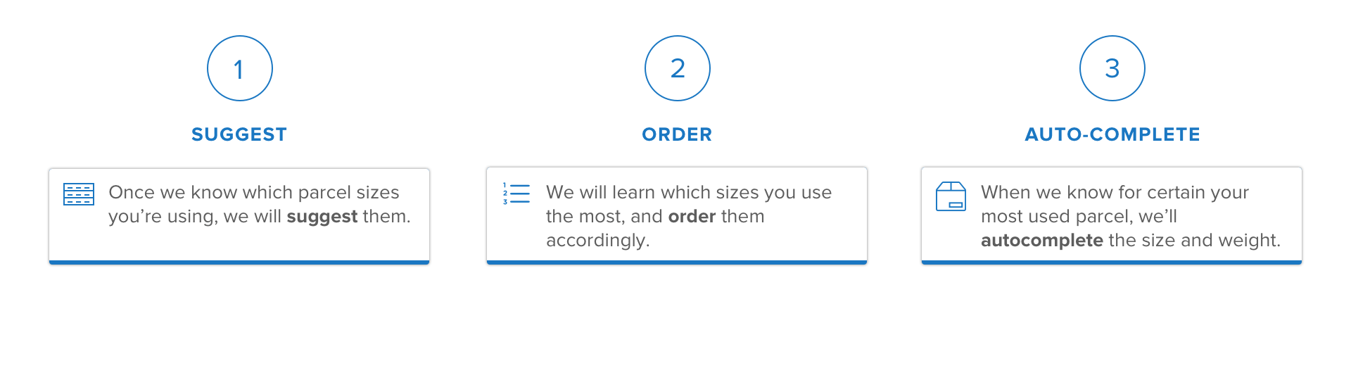
Suggest → Order → Autocomplete
Suggest — the field offers the sizes it has seen before.Order — the most used sizes rise to the top.Autocomplete — and the most likely one is already filled in.
Drop-off
The stages this project went through, in order.
A drop-off point is a place where a carrier delivers or picks up parcels. It can be a post
office, a shop, a bakery, or any other physical location open to the public. The main advantage
of using a drop-off service instead of a home delivery one is that the recipient doesn't have to be there when the courier arrives.
There are four types of service.
As the popularity of drop-off points was rising in France and Germany, Packlink PRO needed to
improve its drop-off selection feature.
The original experience: the interaction wasn't well thought through,
the positioning didn't make sense, and it was mostly unusable.
Use cases and assumptions
There are two use cases of drop-off point selection:
Choose the origin drop-off point where to leave a parcel. This doesn't have to be set inside the software.
Assumptions:
merchants will choose a drop-off point closest to their office
merchants already know their closest drop-off point
Choose the destination drop-off point for the recipient (the client).
Assumptions:
merchants choose destination drop-off services because they're cheaper than delivery
services
merchants choose the drop-off points for their clients
merchants are not familiar with the area where their clients live
merchants want to choose the drop-off point closest to their clients
When assumptions are wrong…
The initial idea was calculating the closest drop-off point to the address of the recipient, and
auto-selecting it.
The drop-off selection flow, with the point auto-selected.The first version of the selection screen, built around the map.
I prototyped the auto-selection flow and tested it with users. Soon we realised how wrong our
assumptions were. It all started with the first one — that merchants choose destination drop-off
services because they're cheaper than home delivery services.
In reality, merchants only chose a drop-off service when their client requested it. They
wouldn't make this decision on behalf of their client, as it would be unprofessional.
Often their clients specified the drop-off point they wanted. Here we revealed the second
misconception: merchants don't have to look for the 'closest' drop-off point, but for the one their client requested. We validated this finding through a survey about drop-off usage.
This finding influenced both the software behaviour and the layout. The auto-selection behaviour
turned out to be confusing, and specifying the recipient's home address wasn't necessary.
Layout, readability and information architecture
The main challenge in designing the interface was providing the right details at the right time. To identify that, I
started by listing all the variables of a drop-off point — name, street,
postcode, city, schedule — and weighed each one by importance from 1 to 3.
Every prototype started as an iteration on paper.
The first iterations of the drop-off selection window put the focus on the map and on displaying
the recipient's address. But realising how merchants actually chose recipient drop-off points
changed our focus. We had to help them identify the right drop-off point based on its name or address.
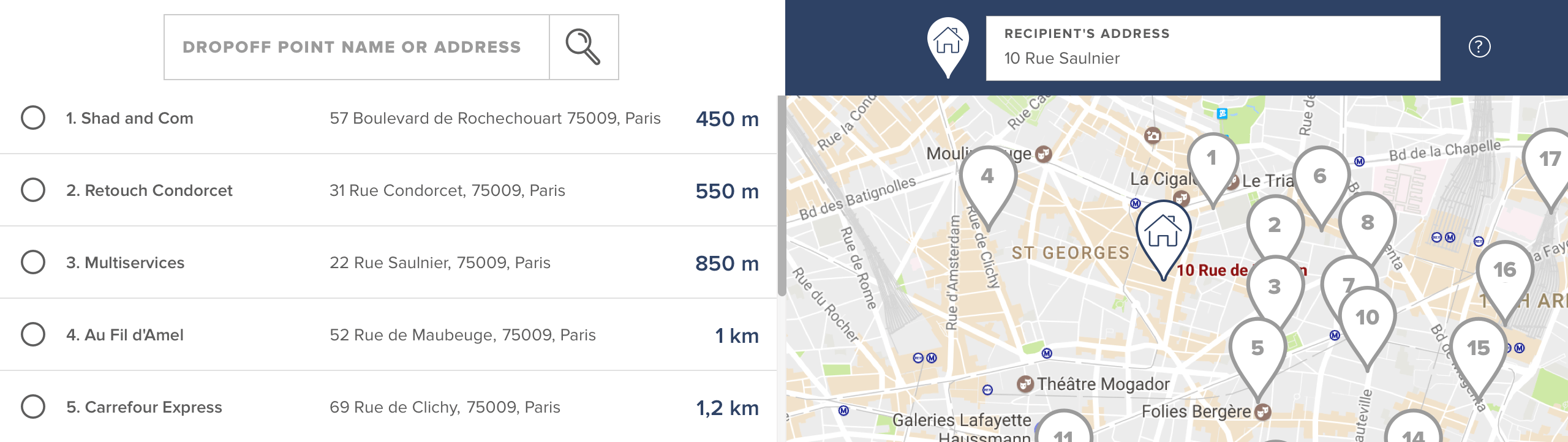
The drop-off list takes more space, and because each point is one line it's easier to skim
through. When there are more than five items, there's a filter.
These decisions turned out to be right. We still allowed users to input their recipient's
address inside the selection screen — however, only 13% of users used that feature. Giving more space to the list
also turned out to be a good design: 73% of users chose the drop-off point from the list, compared to
37% who chose it from the map.
An inherent feature
The redesign of the drop-off selection meant the redesign of many parts of the software.
Everywhere the drop-off redesign landed.
Service Selection
The stages this project went through, in order.
The central value proposition of Packlink is comparing and booking shipping services. The services vary by
price, transit time, and type. Some searches could result in more than 15 options. Even though service selection is an essential
part of the user experience, the layout lacked clarity, focus and readability. The cognitive
load of choosing a service was too big for most users.
A lot of information crammed into an old style design. The services can be filtered by type.
Filtering, ordering and differentiation
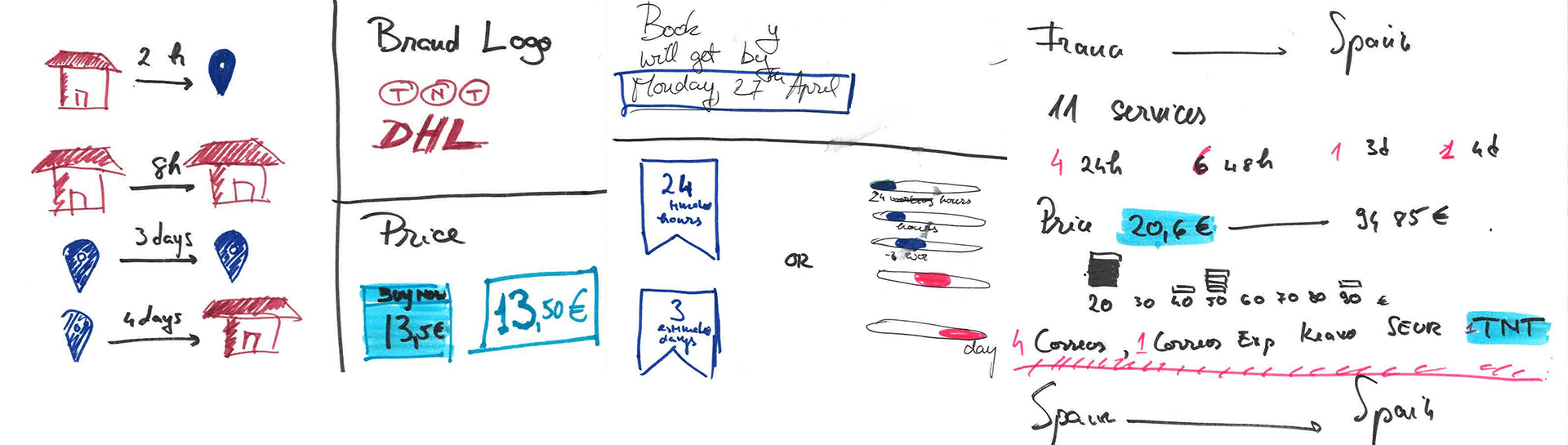
My initial task was to improve selection, so I went head first into the design process:
I listed all the variables I could think of: price, type, brand, delivery time, reliability,
relevance, popularity, recommended
I looked at both direct competition and other comparison websites — flights, flats, anything
where people weigh several options at once
And I wondered: what would improve the selection process for our users?
How do users choose?
By the time I was asking this question, we had already met three customers:
one only cared about the price and always chose the cheapest service
another was more concerned with the reliability of the carrier but
would be ready to compromise for a better price
the third exclusively needed 48h transit shipments
How to help each user choose their preferred service based on their needs.
An obvious interface solution for users who care about price and transit time is an ordering
mechanic.
Ordering, rather than filtering, the list of services.
But what about the one who cared about reliability? We needed more data. So after meeting 8 more users I came back to
this problem, and applied grounded theory analysis to understand it:
I labelled all instances of service selection I found in the observation notes by their main
criteria: transit time, cheapest, reliability, special relationship with the driver, avoiding
a carrier, choosing what their client asked for.
I categorised these labels at a higher level — carrier related, price sensitive, and so on.
I looked at the data we had on each user, about the service choices they made in the past months, noting the number of different services they
chose.
Correlating the number of carriers they chose with their selection criteria, something very
interesting emerged: the users I met could be categorised into three types by their service
selection habits:
those for whom one factor is more important than anything else (price or transit time) — they almost always chose the same service
those who want to choose the best 'price — transit time' combination — they have 1-3 preferred services they always chose
those who balance many different factors (price, transit
time, carrier reliability, past experience, customer choice, destination, the value and
content of the shipment) — they have 3-5 services they chose from
I then looked at the distribution of the number of services over all customers, to
see how the three categories are represented within the user population.
A design solution emerged out of this analysis: 'the favourite service'. Through counting users' choices, the
software can figure out the service each user chooses most often and highlight it. The list is
still visible, so the user can compare it with the others.
The redesign, with the favourite service standing out.
Other considerations
The default order is by price. It is what users felt comfortable
with; doing anything else would have made them feel cheated.
I chose the order over the filter mechanic. Filtering services
didn't provide any extra value to a user who wanted to compare.
Highlighting faster services with a different colour made them stand
out. This way, ordering them by transit time was optional.
I considered adding 'reliability' as a variable, yet this was hard
to achieve from a business perspective.
I designed the layout to guide the user's attention through the important
elements of the card.
Other order factors or filters didn't stand out as relevant, considering the business
environment and technical constraints.
This design didn't get implemented during my time at Packlink.
The line the layout walks a user's attention along.
Table view
The stages this project went through, in order.
The redesign of the table view — the main view users interact with — was a direct result of
observing how users interacted with it. The aims of the table view are:
to give an overview of each shipment
to make quick changes to draft shipments
to allow bulk actions
The consequences of lorem ipsum
The original design befell a common design disease — the infamous 'lorem ipsum'. By not
prototyping with content based on user understanding, the design
didn't consider some pitfalls.
Identifying a shipment is the first action users need to do in order:
to change it
to track it
to see its details
to print the labels
Yet we noticed it was hard to find the right shipment. Users would trace the small-type
recipient's name with a finger on the screen.
The interface failing, measured in fingertips.
The 'table head' was the shipment's contents. But merchants usually sell one type of goods —
they don't sell both furniture and mobile phones. If the shipment wasn't imported, the 'content'
could only be one of 7 choices, and most often it was Other.
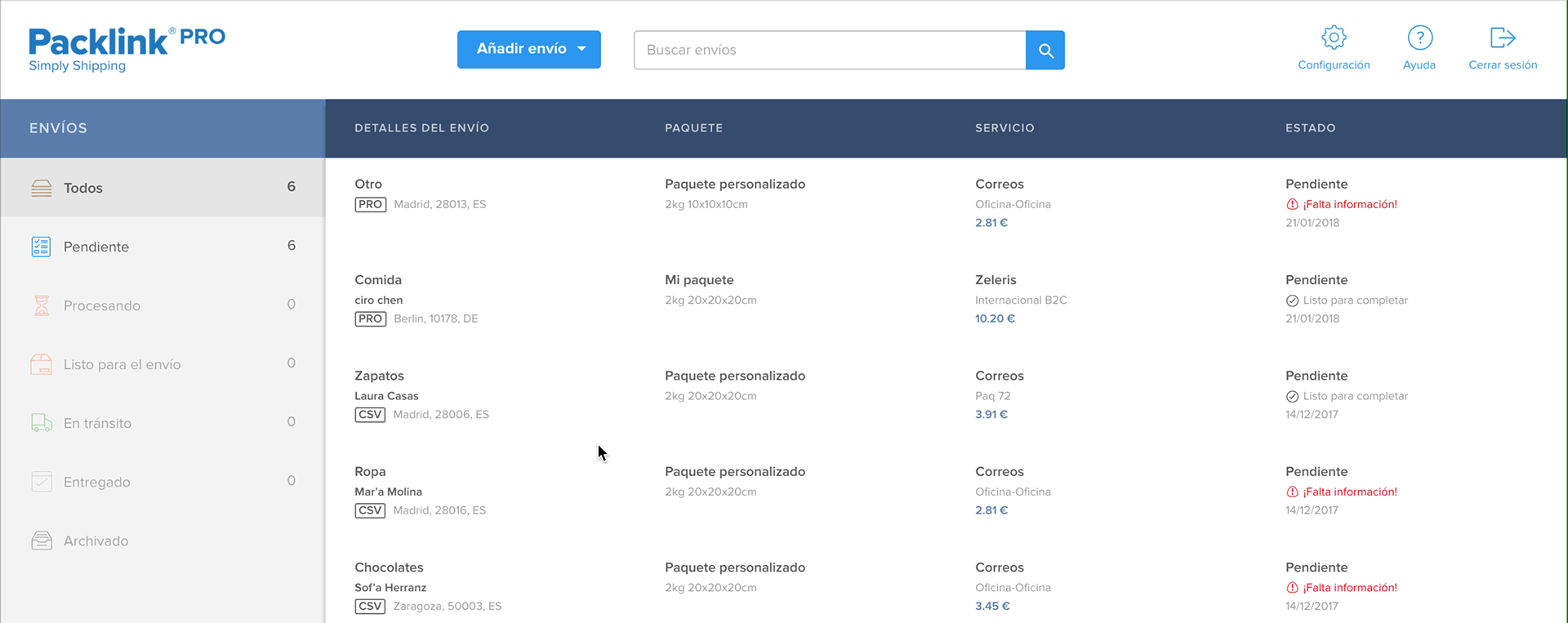
The prototype, on dummy text.The same table in real-life use — one column, one repeated word.
We observed that users felt most comfortable in the 'all shipments' view because it was
consistent. But inside this view, it was hard:
to distinguish editable drafts from non-editable ones
to use bulk actions, only available inside the filtered views
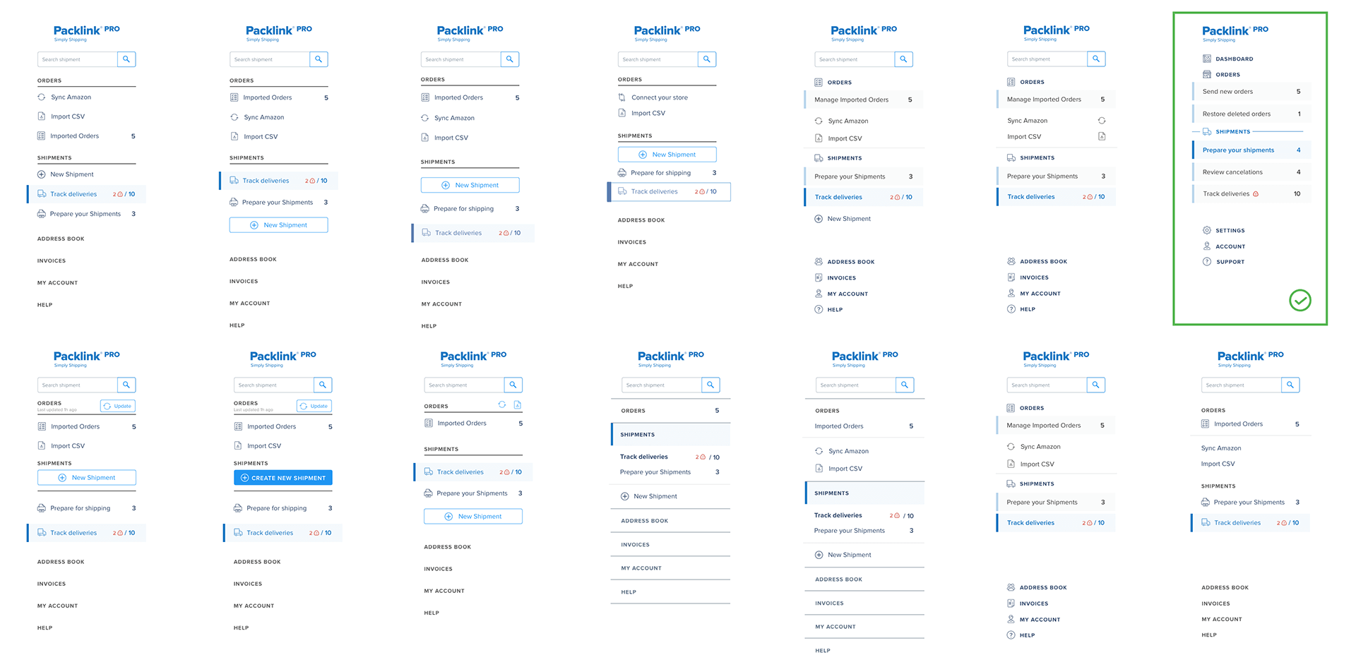
The navigation, inspired by e-mail inboxes.
The redesigns
I redesigned the table view in two steps: first an 'ideal' version, and then a more short-term
realistic 'intermediate' one.
First, I reworked the information architecture of the table row.
The 'ideal' version was built around the concept of groups. I
decided to remove the problematic 'all' view and instead guide
users to what they need from a dashboard.
We tested the dashboard with 15 users before reaching this version.Now, the groups helped focus attention on the tasks at hand.
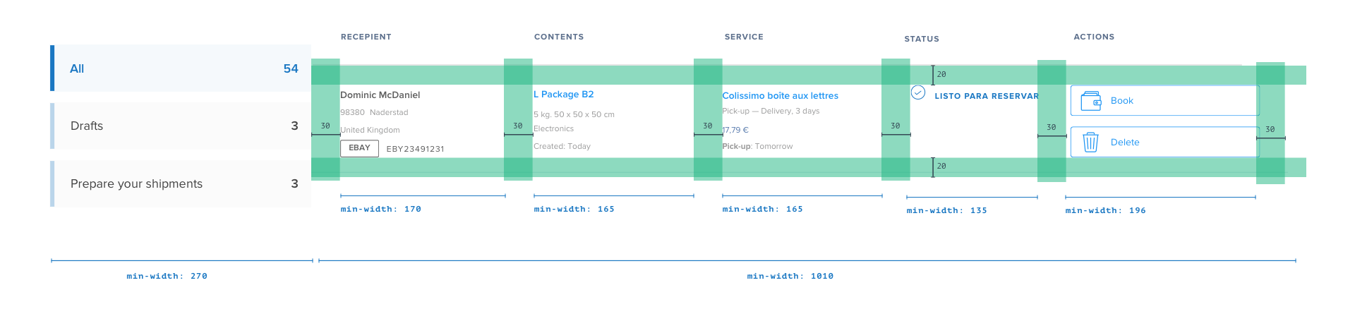
The intermediate, short-term-realistic version kept the 'all' view but made it easier to skim. It also made a
clear visual distinction between editable content (draft shipments) and non-editable content.
Users could now access the main actions of each shipment depending on
its status — they could print the label of a "ready to ship" shipment.
The intermediate version focused on scannability.Accommodating four languages in the design takes some coordination.
The intermediate version was implemented during my time at Packlink.
Looking back…
Out of all the features I worked on, I only saw a few of them go live, and their effects. Yet
the most valuable asset I gained was my growth as a designer and professional. Despite dire limitations and
unfavourable circumstances, I managed to build creative solutions based on user needs. The
following are some of the most important things I learned.
1. If I want it, I need to make it happen
When I noticed a need or an opportunity to build a feature or start a user study, I took the initiative and did it. With support from my manager, I
initiated and conducted in-situ user observations, prototype evaluations and surveys, built new
features, and embarked on building a tracking system.
2. To build a design culture, it takes time, effort and patience
Packlink is a company with a history of mistrust for product processes. Building confidence is a
long, troublesome process that involves more than just doing a good job — it's about building connections, bringing others inside the discovery and creation process, and
standing up for a better product. We only got half-way into building a true design culture at Packlink, but in the end I could already see signs of the seeds we planted.
3. I learned what I enjoy the most about design
As the only designer, I got to cover the entire product process from start to end. This in
itself was a great achievement, and I can now confidently call myself a full-stack designer. Yet
I also know where my strengths lie, and what I love doing: understanding and solving problems.
4. A great user experience is not necessarily set by the interface
Having been trained in interaction design, my first instinct is to solve usability issues by applying spatial design principles. Yet while I was immersing myself in the
product and the user needs, I had a revelation: building a good experience goes beyond what users see and interact with. It is at the level of accommodating their needs within the business and software logic, and
to be a good designer I have to understand both.
5. A good enough design process is possible even in hostile environments
At university I learned that proper methodology is the basis of
every study: tracking independent and dependent variables, getting statistically significant
results, building a theory. But in the messy conditions of a startup with tight deadlines and little support for user-centred design, these are unreasonable requirements. Yet I learned that it is perfectly reasonable to aim for a 'good enough' user-centred research methodology. This will bring more value in the long run than empathy and intuition alone.